
Registration Process

How to improve the volunteer mission application tunnel?
Who?
Vendredi is a website where employees can go if they want to do some volunteering. The platform helps companies, employees and charities find each other and organize volunteering days.
What?
Vendredi‘s new in town, and it’s growing fast. They want to reduce friction during the registration process. Indeed, 1 user out of 4 drops their candidacy for a volunteer mission.
Design Process

We did it all
For this project, we focused on every step of the double diamond.
We met Vendredi’s Product Designers and they told us about their problem.
📅 We were able to manage our planning by ourselves
User interviews & tests
To tackle this, we thought the best way to get straight to the heart of the problem was to see how users feel when they’re using the platform. To get a clearer picture, we also asked them about volunteering in general.
Our goals
1.
Identify the needs and expectations of employees in the mission application process
2.
Identify friction points in the mission application process
3.
The interview part: Why would they participate in a volunteer mission? Or why wouldn’t they?
5 users
💻 Video Call
⏲️ 30 min. each
Charlotte
32,
retraining
Toulouse
Naïm
32,
Engineer
Dunkirk
Simon
31,
developer
Troy
Andréa
26,
Designer
Paris
Jonathan
29,
Product Manager
Paris
The task
The task that was asked on Vendredi’s actual website: To pick a mission and ask their manager to validate the days they chose.
What came out

3/5
Were discouraged by sending an external link to finalize their application

5/5
Encountered friction when entering dates

2/5
Would have found it useful to know where they are in the application process
Our 3 main problems
1
Problem redirecting to an external page
2
Consistency and date entry problem
3
Application status visibility issue
How might we
How?
1. How could we integrate the registration process on the platform?
How?
2. How could we facilitate the entry of dates ?
How?
3. How could the user be informed of the progress of his registration?
Benchmark
Calendly
Je m’engage.fr
As a way to resolve the date entry friction, we looked at Calendly who is specialized in the matter.
We also wondered how jemengage.fr was doing as they’re a competitor of Vendredi.

Choose availability – Calendly

Choosing dates – Je m’engage.fr


Zalando
La Poste
We found the idea of using a stepper very interesting. Like here in Zalando or La Poste, it allows the user to know what’s going on and what’s going to happen.
Malt

View of a mission – Malt

Malt’s message space with notifications inside

Mission overview in a small card – Malt
Our ideas

We should add a simple application form that goes into Vendredi’s flow to save the user some time.
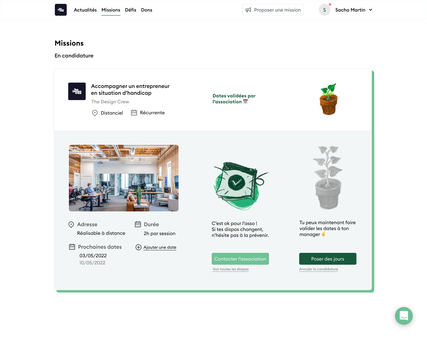
On the mission page, we want to add a stepper so that the user has more visibility and doesn’t drop its candidacy.
The stepper will be illustrated with a growing plant in order to gamify the flow. It can make the user feel happier which will make him stay.
We aim to simplify it as much as possible, making it 2 columns instead of 3 and using unfolding cards to show the missions.

Prototype
Our first version

On the left :
We decided that all missions’ descriptions should have the same names: THEMES, NEEDED SKILLS, WHEN, WHERE.
On the right:
We took away the free text fields so that the user is directed to a form on the next step.

Here is the application form. First, we have basic information.
Then we added different ways to add dates so that it is not in a free text form anymore. There is also a possibility to say « I’m flexible ».

On the left:
The folding cards indicate where we are from the application process to the end of the mission. There is also a CTA that takes the user to the next thing he has to do.
On the right :
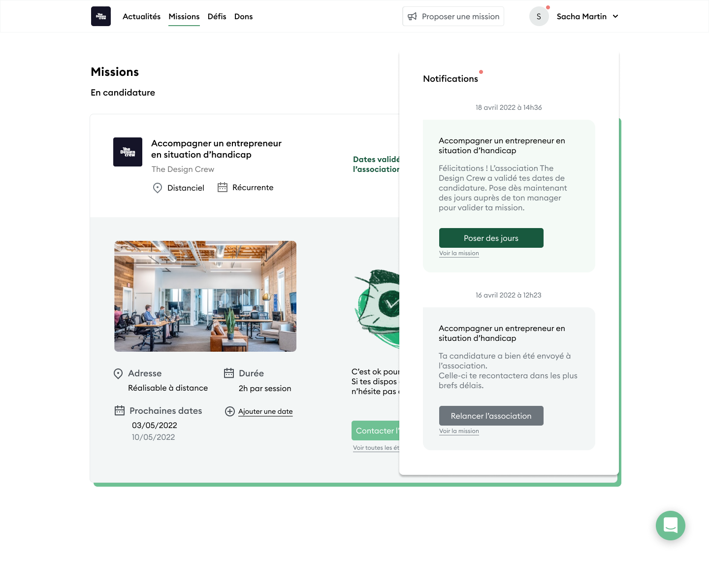
The message space, where Vendredi also sends messages to inform the user about what’s going on. It can also send CTA.
User tests
Let’s test our prototype to see what works and what doesn’t.
Goals
1
The application form
Checklist :
✅ They understand it
✅ The fields make sense
✅ The important steps are understood
✅ The mains CTAs are easy to find
2
The mission page.
Checklist :
✅ They like the stepper
✅ They like the plant
✅ They like the new cards design
✅ They like having notifications in the messages
✅ They like the new UX of the page
5 users
💻 Video Call
⏲️ 30 min. each
Charlotte
32,
retraining
Toulouse
Séverine
28,
Motion Designer
Nantes
Simon
31,
developer
Troy
Camille
26,
Psychologist
Dunkirk
Yann
30,
Data scientist
Paris
So, what happened
5/5
Did not fully understand how to fill out the form.
– Why put the same day twice?
– How to add multiple availabilities?
– Why is « I am flexible » here?
The Form


The message space
Users were expecting notifications and were surprised to see it was a message space.

The candidacy space
Users were happing to see the stepper and would have wanted to see their progress in the folded cards.

Solution
What we think we should do now
To modify it according to what users didn’t understand or were missing.
Add a progression bar in the folded version. Improve the top left UI to make it more understandable.
Make it a notification space and let messages go to the message page only.
To make things more accessible and make our Primary CTAs more visible, we could use Vendredi’s dark green.
Iteration
Here are the changes we made.


Prototype
Next Steps
We could do more than this
Make it all one card.
In the mission space, we could try to make it even more minimal by having 1 card by mission.
This is one version I did after the group work was over.
In addition to the unique card, I think we can have a proper notification space and talk to the user in a more casual/friendly way.
There is still lots of room for improvement, like testing that idea and challenging other parts of the registration process, like the mission search process or the rating at the end.
Thank you for reading!
with Clémence Végnant
& Suzanne Durand
@The Design Crew
